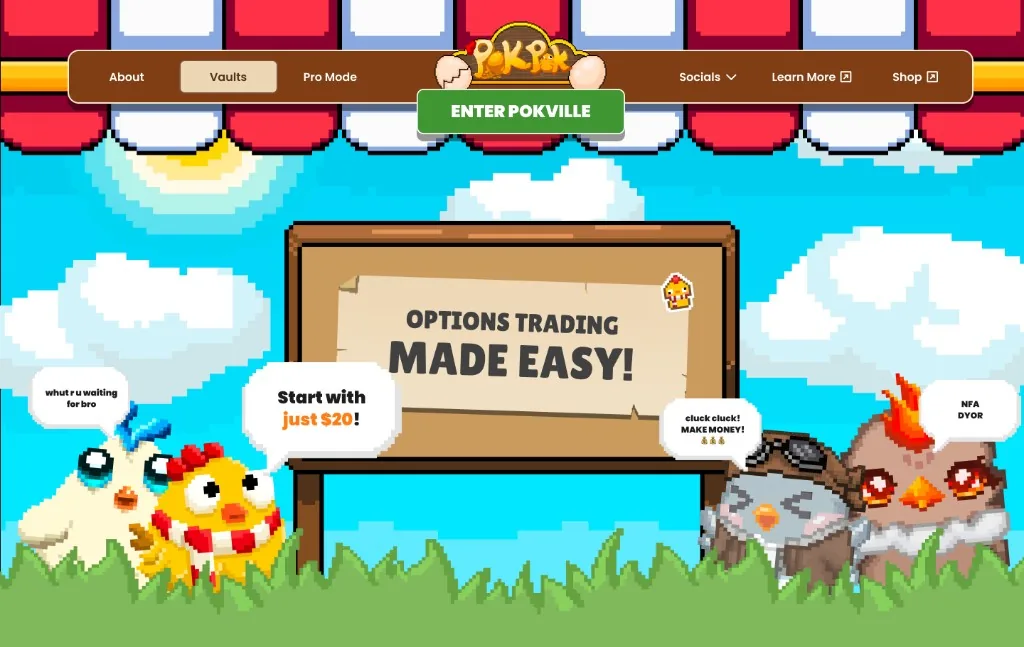
Options made learnable for first-time traders. $3M+ notional in month one on Base.
Role
Lead Product Designer, solo
Timeline
19 months
What I did
User research, personas and journeys
UX architecture for Game, Pro and Lite modes
Design system and UI design
Mint flow and onboarding rebuild from drop-off analysis
Making options trading learnable for people who had never traded options, by turning every step of the instrument into looking after a chicken.
PokPok is a gamified options protocol on Base. Options vocabulary is a wall for first-time traders, and the usual answer - a tutorial - rarely gets finished. As Lead Product Designer I owned design end to end, from first concepts through launch: the metaphor, the mode architecture, the design system, and the mint funnel rebuild that followed from drop-off data.
Goals
Make the instrument learnable by doing, not by a tutorial wall.
Give beginners a path that still works once they outgrow Game Mode, without sending them to a competitor.
Stop the mint funnel from leaking the people the product was built for.
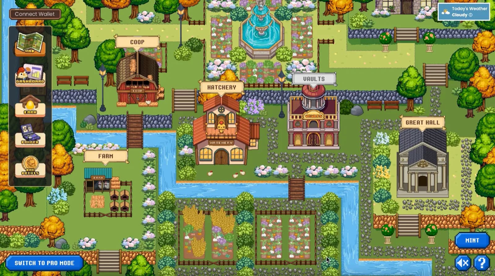
Pokville, the hub map - the protocol laid out as a town, with the Hatchery, Coop, Farm, Vaults and Great Hall as separate buildings users navigated between
Results
$3M+ trade notional in the first month after launch on Base. Product-level outcome during the period I owned design end to end; the work below is the design that made the instrument usable by first-time options traders.
Mint completion time down 80% after I rebuilt the Hatchery from step-level drop-off analysis and usability tests. Baseline: about four minutes on average to mint a single option across a multi-page flow.
Mobile adoption up 70% after I proposed and designed Lite Mode - same protocol and gamification, game art dropped - when the fixed game-art layout could not go responsive.
Every surface in the protocol
Design covered the whole map rather than one flow, so every building in Pokville and the reference material around them went through me:
The Hatchery, where an option was configured and minted
The Coop, where open positions were monitored and fed
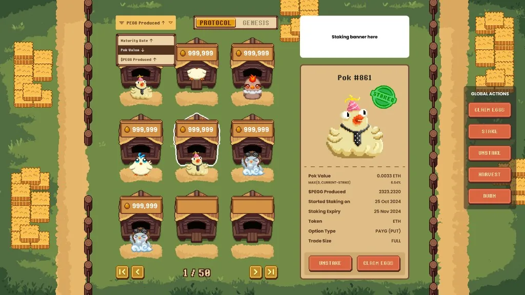
The Farm, where healthy positions were staked to earn $PEGG
The Vaults, an agentic options trading solution for hands-off users
The Great Hall, where users could see what whales were doing and copy their trades
A dashboard for all-time profit, active positions and leaderboards
The Pokdex, a Pokedex-style reference for what each chicken represented and the instrument behind it
A minigame that paid points and in-game rewards for acting on the protocol
Three modes, one protocol
Options are hostile to beginners. The vocabulary alone - strike, premium, tenor, expiry, moneyness - is a wall before any money is at stake, and the standard answer is a tutorial nobody finishes. PokPok's answer was to stop explaining and start representing: build the whole instrument as a thing you look after, so the mechanics were learned by doing rather than read in advance.
Beginners were the point, but they did not stay beginners - and a product that only served the first week lost people in the second. So I led the design of three modes: Game Mode to learn in, Pro Mode for once the training wheels were off, and Lite Mode, a stripped-down phone version that kept the gamification but dropped the game art. The clearest way to show what that meant was to follow one product - a Pay-As-You-Go option on ETH - through them.
Game Mode: an option is a chicken
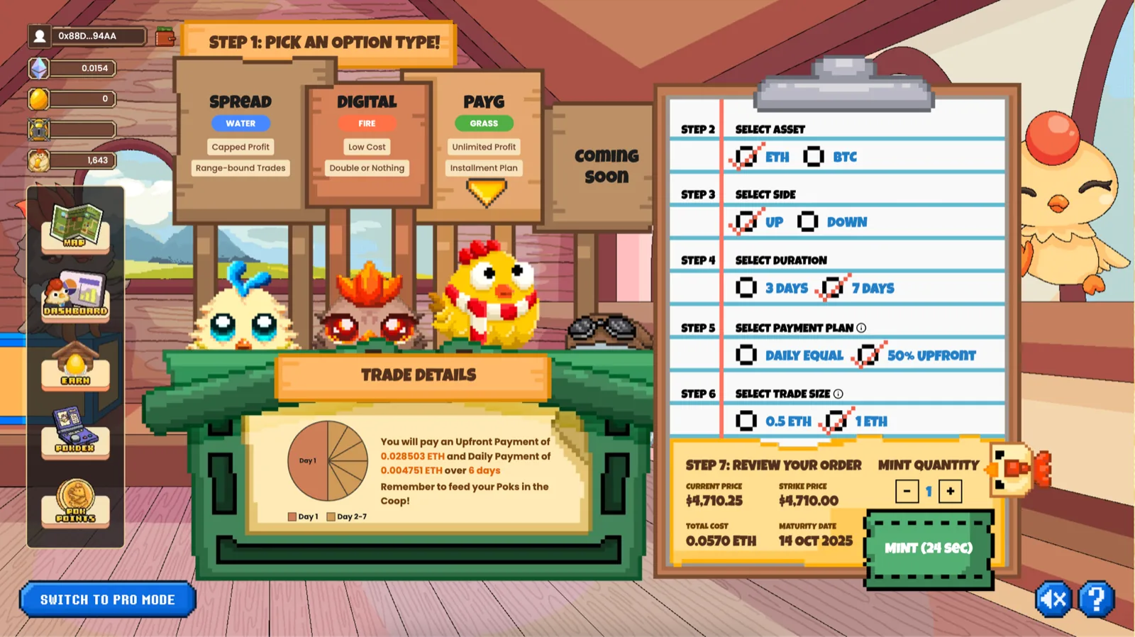
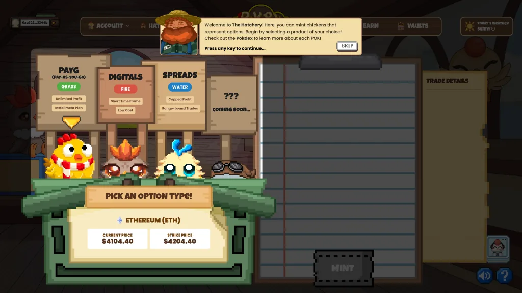
The Hatchery - option types as elemental chickens, with each sign stating the trade-off of the instrument beneath it
My rule for Game Mode was that the gamification had to map one for one onto the instrument, not decorate it. Minting read as hatching, and the three option types read as elements with their trade-offs written on the sign above them: PAYG (Pay-As-You-Go) as a Grass chicken / Grass Pok for unlimited profit on an installment plan, Digital as Fire for low cost but double or nothing, Spread as Water for capped profit on range-bound trades. The order review still showed strike against current price, total cost in ETH and a maturity date, so a beginner was making real options decisions in plain language rather than a simplified version of them.
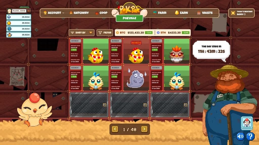
The Coop - active positions as chickens in a grid, each with intrinsic value, strike price and maturity, plus Starved status when a PAYG / Grass Pok had not been fed
Positions then lived in the Coop, where a Grass Pok had to be fed on its PAYG installment plan. If it was not fed, it went Starved - the position terminated and the premium already paid was lost. You could also stop feeding on purpose if you no longer thought the option would pay off. Intrinsic value, strike and maturity sat on every card so the gamification never hid the instrument.
Pro Mode: the same product, stripped
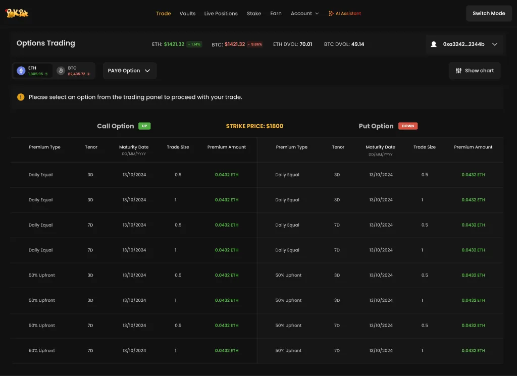
Pro Mode - the same PAYG product as a dense options chain, with call and put columns, tenor, maturity and premium
Pro Mode was the same product with the gamification removed: a two-sided chain of calls and puts, premium type, tenor, maturity date, trade size, live DVOL. No steps, no guidance, no chickens. Digitals and spreads sat on the chain too; the same PAYG option that was a Grass Pok in Game Mode was just the simplest way to show the surface. A trader who already knew what they wanted could read the whole surface at once and act.
Switch Mode was a toggle rather than separate products - that was the whole argument: one protocol, different doors in, and a user who outgrew one could switch to another without leaving.
Vaults, inside Pro Mode
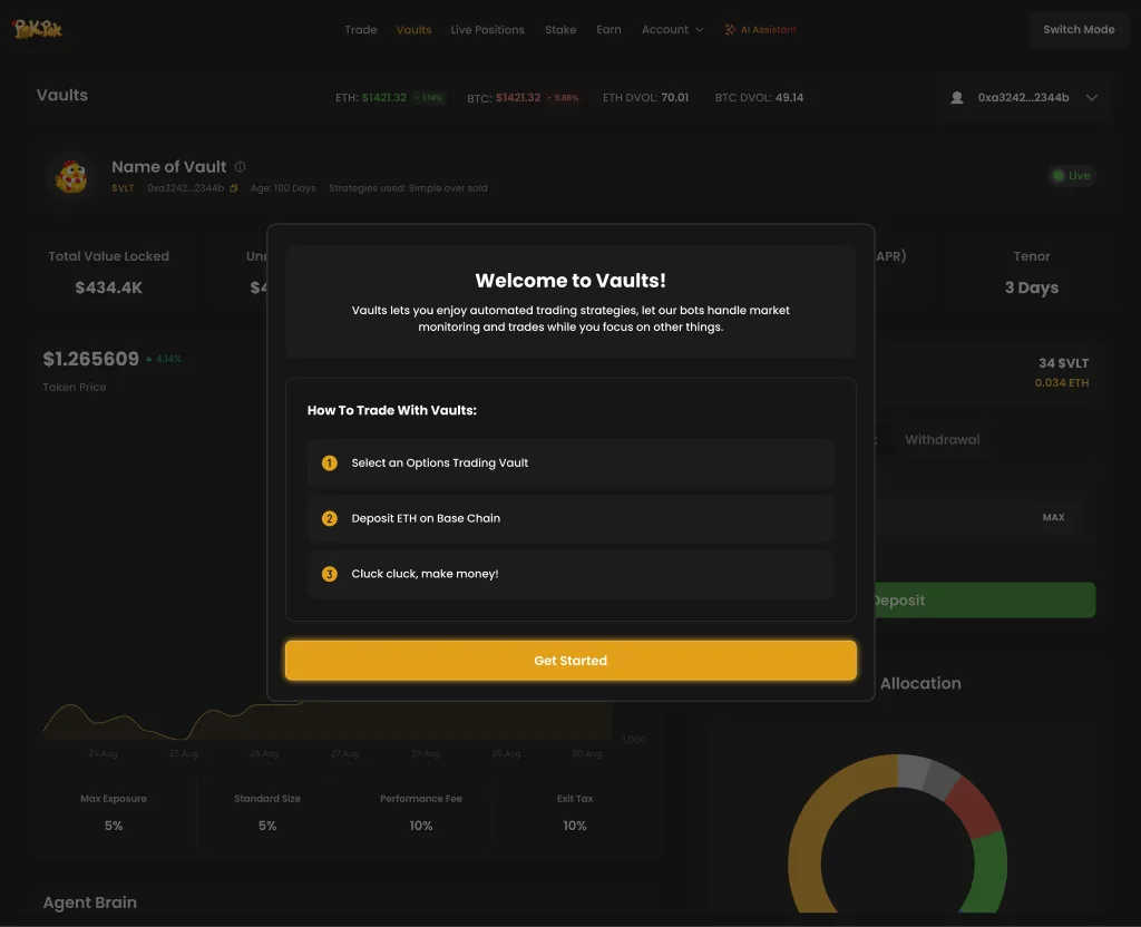
The Vaults inside Pro Mode - an agentic options trading solution with total value locked, APR, tenor and allocation
Pro Mode also held the Vaults, an agentic options trading solution for users who would rather not operate anything themselves - pick a vault, deposit, done. Handing the trading to an agent makes trust the whole design problem, so the surface I designed led with the numbers that decide whether someone commits money rather than the ones that make a vault look good: total value locked, APR, tenor, allocation, fees.
Lite Mode: the phone version
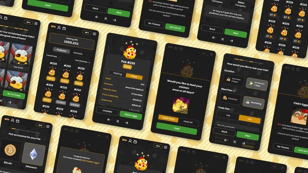
Most of our users were on mobile, but the site could not be made responsive: the game art was fixed, so the layout it sat in could not reflow onto a phone. Rather than accept that the majority got the worse product, I proposed Lite Mode - the same protocol and the same gamification with the game art dropped, laid out for a phone instead of squeezed into one.
It also gave a route in to people who wanted the product without the vibrancy and sensory overload of Game Mode, so it was as much an accessibility decision as a mobile one.
Lite Mode on mobile - minting, feeding, staking and claiming golden eggs from a phone-sized flow without the full game art
The split expanded who the product could serve without fragmenting it. Three ways in, one protocol underneath - and, more to the point, a route out of the beginner mode that did not mean leaving for a competitor.
Cutting a four-minute mint down to one page
Before
The earlier Hatchery spread minting across multiple pages, with more steps than the decision warranted. I do not have those screens here. What I have is the drop-off: users took an average of four minutes to mint a single option, long enough for a beginner to lose track of what they were actually buying.
What the data changed
I believed the leak was the length of the flow, not the screens we already liked. Drop-off by step and usability tests on the worst offenders said which steps to kill. The four-minute average was the signal; a polish pass on the existing pages would have left the length.
After
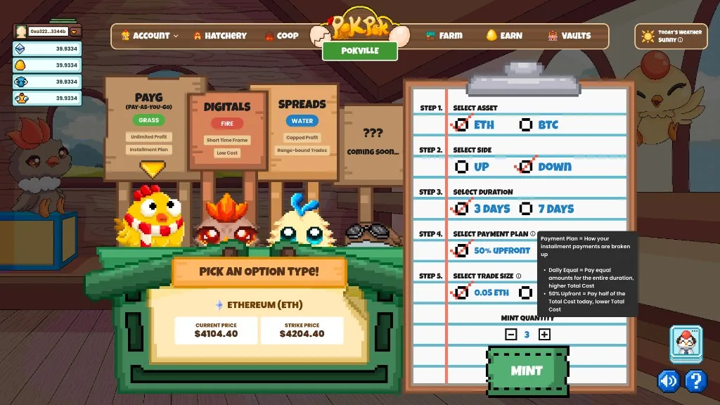
The Hatchery condensed onto a single page - configuration, payment plan and order review in one view
The fix was to condense the whole mint onto one page. Every choice sat in a single view with the order review beside it, so the cost of changing your mind was visible where you changed it. Pie charts and graphs carried the payment plan and the potential profit, because a beginner reads a shape faster than a row of numbers. The form also remembered the last configuration used, so a repeat mint did not mean setting every field again.
First-run guidance in the Hatchery - a farmer explained what minting was and pointed to the Pokdex before handing over control
Guidance sat one tap away instead of in front of everyone: tutorials for anyone who found the page heavy, skippable for anyone who did not. The target was decision paralysis rather than clicks - make minting quick and fuss free, and let the people who wanted the detail go and get it.
Making consequences legible
The Farm - staked Poks in coops with Protocol and Genesis tabs, plus a detail panel for value, $PEGG produced, staking dates and claim actions
When a position went bad at maturity, the interface made it legible. An option that expired out of the money did not quietly grey out - you got a diseased Pok, which could only be burned for a small amount of $PEGG. Expiring worthless is the hardest thing to explain to someone new to options, and making it a visible condition on an animal they had been looking after did more than a tooltip ever did. Profit worked the same way round: a healthy chicken could be harvested for its value in ETH, or staked in the Farm to keep earning. The gamification was not decoration on top of the mechanics; it was a one for one mapping of them.
Considered and rejected
A tutorial as the way in
This was the closest alternative, because it is what options products usually do: a lesson, then the real instrument. It lost because tutorials rarely get finished, and the people the product was built for needed to act, not watch. The chicken mapping won because every game verb was a real instrument verb, so learning happened by doing.
Game Mode and Pro Mode as separate products
Beginners and traders looked like two markets, so two products were on the table. That would have been the right call if graduating meant outgrowing the company. It lost because a user who finished Game Mode would have to leave. Modes on a toggle keep one protocol and several doors in.
Squeeze the game-art layout onto phones
Making Game Mode responsive would have been simpler if the art could reflow. It could not: the layouts were built around fixed game art. Shipping desktop-only was the other option, and most users were on mobile, so it was not really an option. Lite Mode dropped the art rather than fighting it.
Takeaways
Map the metaphor, do not decorate with it
Gamification only teaches when every game verb is a real instrument verb. Hatch, feed, starve, harvest and burn had to mean mint, pay premium, terminate, close for ETH and scrap an OTM position - or the chickens were just chrome.
Fix the step that is actually leaking
The mint redesign started from drop-off by step and usability tests on the worst offenders, not from a polish pass on the screens we already liked. The four-minute average was the signal; the single-page Hatchery was the response.
One protocol, several doors in
Game, Pro and Lite were modes on a toggle, not three products. Beginners needed a way to graduate without leaving, and mobile users needed a layout the game art could not give them. Same instrument underneath; different doors in.